


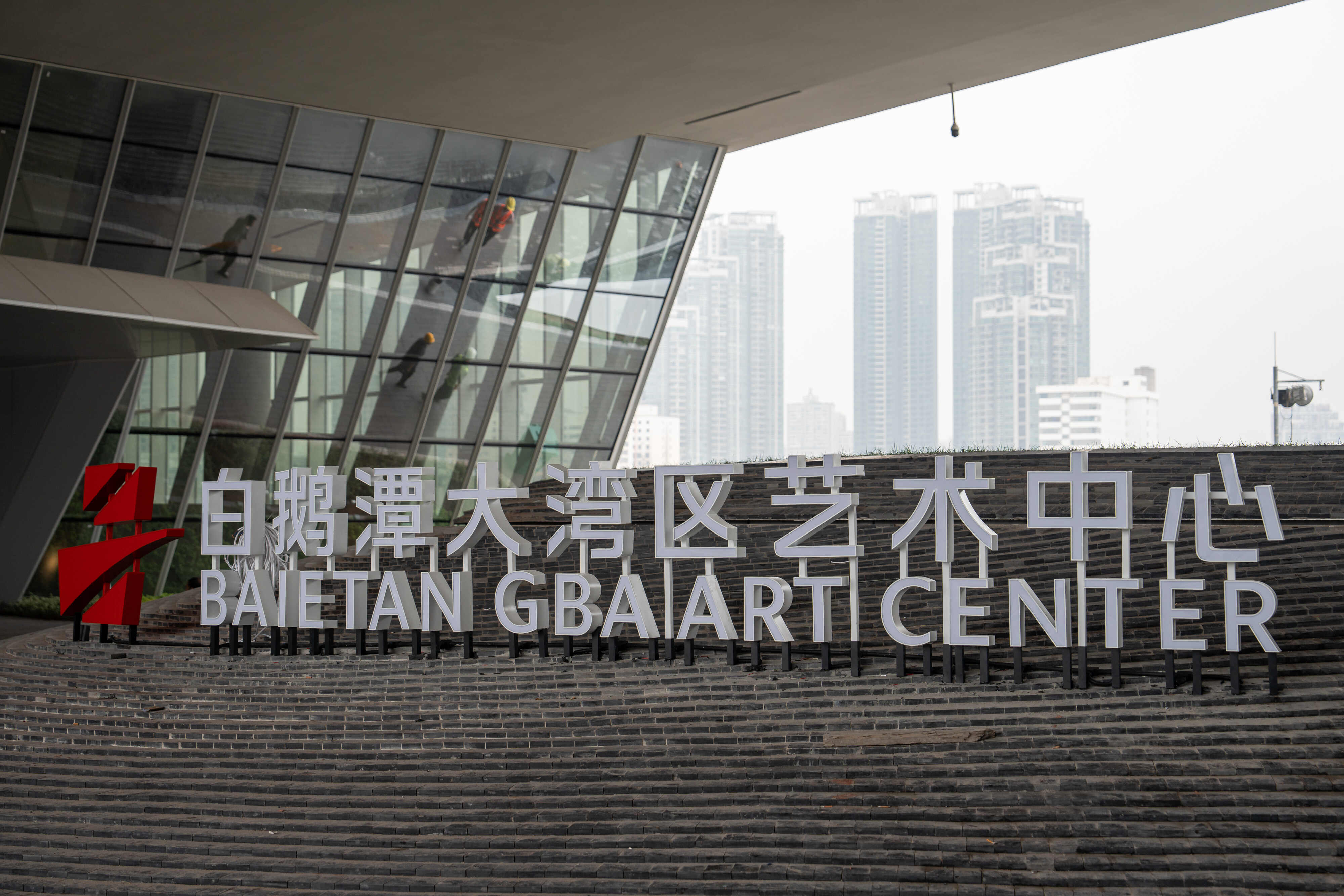
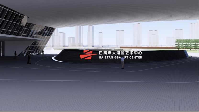
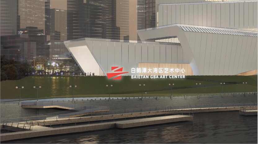
Recently, as the Bai'etan Greater Bay Area Art Center is about to open, its official logo has been unveiled.
The overall design concept of the logo is "jointly developing a cultured bay area, lighting up life with art", with Kan Tai-keung, an international graphic design master and honorary professor of the Hong Kong Polytechnic University, serving as the artistic advisor. The design team includes Xu Lixian, the 8th chairman of the Shenzhen Graphic Design Association, and Hong Ko, a member and vice chairman of the Hong Kong Designers Association, as well as Lin Yuzhi, vice chairman of the Shenzhen Interior Design Association."
According to the design proposal, the logo is inspired by "convergence of three rivers," "connection of three regions," "integration of three museums," and "connection of eras."
To express the goal of integrating and developing the culture of Guangdong, Hong Kong, and Macao, and co-building a cultured bay area, the graphic design skillfully integrates the shapes of the Chinese characters "艺(art)" and "粤(Guangdong)", , which suggests that the Bai'etan GBA Art Center, like a giant ship carrying culture, sets sail to represent the cultural achievements of the Greater Bay Area to the world and serve as a bridge connecting cultures worldwide.
The logo consists of four red blocks, exuding a dynamic and stylish yet simple and distinct aesthetic. It creates a striking contrast with the white architecture of the Bai'etan GBA Art Center and its surrounding environment, instantly catching the eye and symbolizing the idea of "lighting up life with art".
The distinctive red color also embodies the spirit of the times and the innovative and enterprising outlook of the cities in the Greater Bay Area, and demonstrates the new outlook, atmosphere, and vitality of cultural prosperity in the Greater Bay Area.
What's so special about the four red color blocks? We can learn more from the three hidden "threes" within the logo.
In its architectural form, the logo embodies the convergence of the three rivers into the Pearl River. The location of the color blocks aligns with the former, middle, and western waterways of the Pearl River in Guangzhou, pointing towards the unique convergence point of the three rivers. The gentle flow of the Pearl River infuses vitality into the waterways, constructing a bridge reminiscent of flowing water.
The convergence of forms merges the epitome of history with the prospect of the future. Bai'etan was once a prosperous port along the Maritime Silk Road, serving as a super-hub for trade between the East and the West, which contributed to the splendor of the Thirteen Hongs of Canton. Nowadays, with the connection of the "Bridge of the Times," the public can look back at the city's history, experience innovative creativity, and envision a bright future. The geographical layout symbolizes the unity of three regions with blocks representing Guangdong, Hong Kong, and Macao respectively. The Bai'etan GBA Art Center will not only rise as a new cultural landmark for the Bai'etan district but also guide the cultural development of the entire Greater Bay Area, becoming a new cultural beacon for the region, serving as a bridge linking cities, regions, and the international community.
Meanwhile, the logo's design forms a unique combination of the Chinese characters "艺" and "粤". "艺" represents the fusion of art within the Greater Bay Area, where cultural exchanges converge between different regions and internationally. "粤" signifies the central location of the Bai'etan GBA Art Center in the heart of Guangdong's provincial capital, symbolizing the core of the city where the venue is situated.
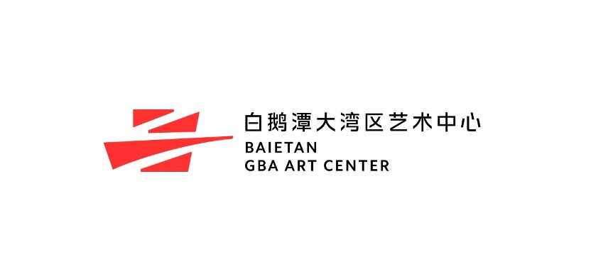
In addition, the venue distribution presents a "three-in-one" concept. The three red blocks respectively represent the Guangdong Museum of Art, Guangdong Intangible Cultural Heritage Exhibition Center, and Guangdong Museum of Literature, connected by bridges to achieve the "three-in-one" layout. This linkage allows traditional Lingnan culture to merge with contemporary culture, facilitating the mutual integration of Chinese culture with global culture, and injecting more cultural vitality into the future development of the Greater Bay Area.
Source: Yangcheng Evening News