(Photo: Administrative Affairs Bureau of the Guangdong-Macao In-Depth Cooperation Zone in Hengqin)
On August 29, the Guangdong-Macao In-depth Cooperation Zone in Hengqin officially released its new brand visual identity. It is inspired by the Bingdi lotus, a rare type that carries a pair of flowers on each stalk, unlike most other species which typically have a single flower. This vividly reflects the harmony between Hengqin and Macao.

(Photo: Administrative Affairs Bureau of the Guangdong-Macao In-Depth Cooperation Zone in Hengqin)
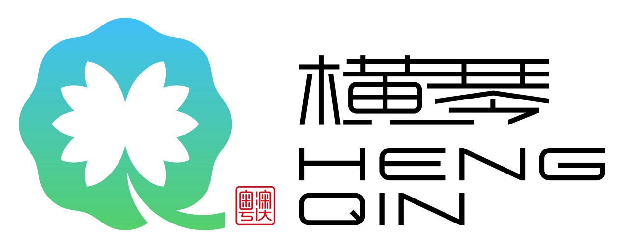
The new logo incorporates the letter "Q," representing "Qin" from Hengqin, into the design. The negative space in the middle forms the silhouette of a Bingdi lotus, symbolizing the unity and shared prosperity of Hengqin and Macao.
The octagonal shape in the design represents lotus leaves, symbolizing the support and effort from the central government, Guangdong and Macao governments, and all parties involved. The lotus stem, extending to the right, further emphasizes the shared roots and cultural heritage of Hengqin and Macao, rooted in Chinese culture.
In terms of color, the logo adopts a gradient of blue and green.The blue symbolizes the limitless possibilities for Hengqin, and the green conveys openness and inclusiveness of the island.
This visual identity will be applied to various major events within Hengqin, including city promotion and investment attraction activities. It will also be featured in public buildings, image displays, and special districts within the island.
Reporter | Eastbrook
Editor | Nan, Will, James


